Want more effective social media posts? Starts with a good graphic.
There’s one mistake I see a lot of businesses make. And it’s SUPER easy to correct. What is that mistake?
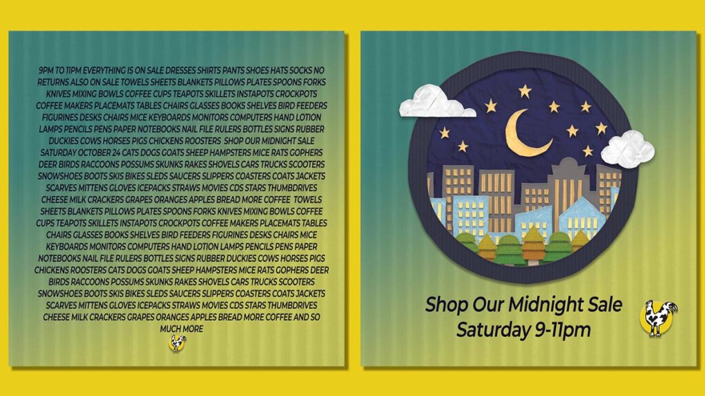
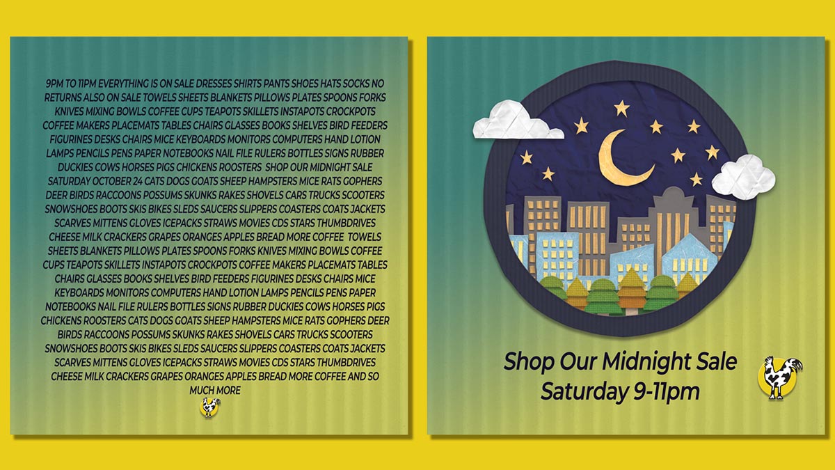
It’s packing WAY too much information and text in a graphic posted to social media, texted, or otherwise shared. Look at the two images below for 1 second. Which catches your eye more? Do you know what day the sale is?

Bad and Good Social Media Graphic Examples
Most people quickly scan social media posts, if you can’t grab attention in just a second or two, you won’t. Also many people may be viewing on a mobile device. How legible is the left side on your phone? Probably not very.
Granted the left side is an exaggeration. But I have seen many graphics that aren’t much cleaner than this. Many businesses try to cram everything into a graphic, and don’t realize people will just gloss over all that text. Low cost tools such as Adobe Spark and Canva make it really easy to create a graphic, and they also make it really easy to cram in a lot of information and distractions. Take a few minutes to consider what the 1 thing you want people to know when you post. Is it every last item that’s on sale? Or is just knowing when the sale is that’s important?
If it is important to know what is on sale, that’s a great opportunity for follow up posts, just pick one, still include the when, and a graphic of that item. If you are running an ad, focusing on one item will result in a more effective ad as well.
If you are also planning on using the graphic with an ad, then you really must have a clean graphic and minimal text. Cram too much text in and your ad will be rejected.
A far more effective post will have a cleaner graphic like on the right that has the basic information. Then add more details in the text of the post. The text part of your post will scale to an appropriate size for phone, tablet and desktops. Text on an image will not resize, just the overall image will.
How to Tell If the Graphic is Clear Enough?
Here’s a simple way. Describe the image as concisely as possible. Does it relate to what your post is about? It doesn’t have to be literal, but be in the ballpark. If it’s no where near, then find another image. In the example above, a night sky above a city illustrates the night part of the sale. You’ll also need this description for your Alt Text.
What is Alt Text?
I’m glad you asked! Alt Text helps viewers in a number of ways.
- It provides the description of the image to screen readers so those unable to see will know what it is about.
- It will provide the image description should your image not show for some reason. (poor connection, slow load speed, etc)
- It can make your post more searchable.
How to Add an Alt Tag to a Graphic on Social Media & Websites
Fortunately most social media platforms are becoming more accessible, and they are making it easy to add alt text to graphics & images. It just takes a short while to get in the habit of adding them. WordPress makes it easy as well.
Even though it is easy, you may be thinking you don’t have any blind customers, do I really need to do this? The answer is YES! First, the reason you don’t currently have sight challenged customers is because you’re making it hard for them to do business with you. Secondly, it’s not only helpful to those with a sight problem. I know a lot of people that use some sort of text to voice while driving, cooking, running, or other activity where they can’t constantly look at a screen. You’ll also be future proofing your website and social posts. With digital devices so prevalent, vision problems are on the rise. We need glasses at a younger and younger age.
Instagram Alt Tag Instructions
WordPress Alt Tag Instructions – you may need to refer to to your theme instructions.
A more detailed guide to how Alt Text works, and best practices can be found in this article by Penn State.
Bonus Tip:
If the sale (or whatever you are promoting) is on your website, make sure to put that link in the text of the post so it is clickable. Unless you’re offering something absolutely amazing, no one is going to bother typing in a long link if you only put it in the graphic.


0 Comments